
I designed a website with hybrid functionality - portfolio & business, to establish TESA's online presence.

The Edit Space is as a supportive space for upcoming film and video editors. It nurtures their skills and guides them on industry best practices in a community framework. It fulfills this purpose by providing an enabling and affordable work environment with state-of-the-art facilities. The company vision also prioritizes its post-production service, and this will reflect in its website structure.
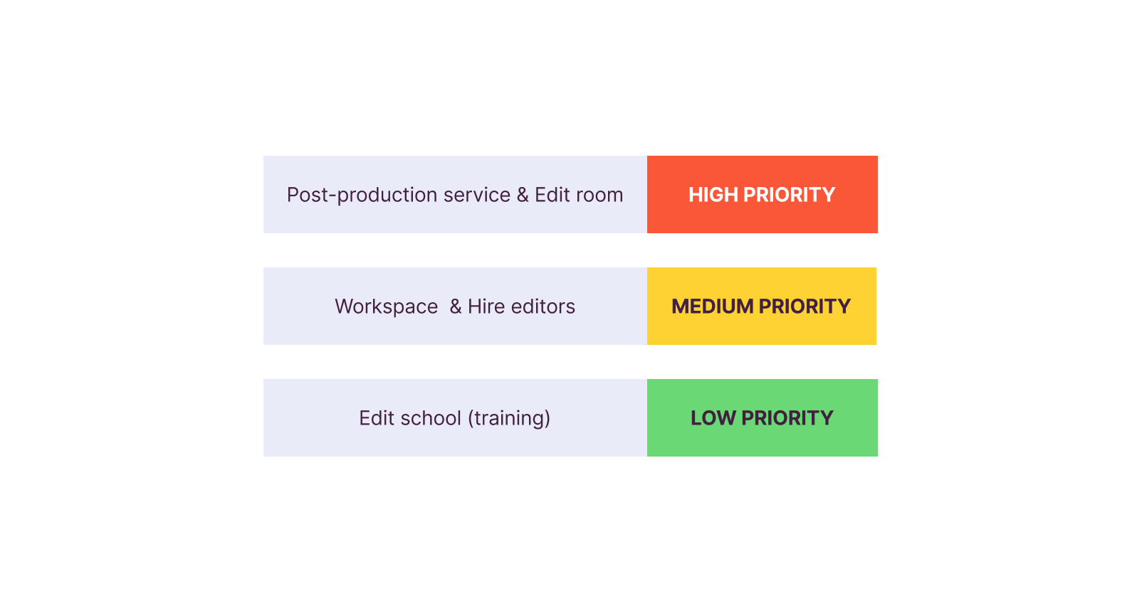
I met with the clients to understand their proposed services at a deeper level, their capabilities, workflows and expectations. Following this, I was able to categorize their services and map out user flows that would be beneficial to both the client and prospective users.
At this stage, I would have loved to have some sort of user research to further validate prospective user behaviors. Unfortunately, due to certain constraints, I had to forgo that and rely on mapping on assumptions. One failsafe I included in this stage was to ensure all services could be easily accessed from multiple entry points. This flow was refined following various reiterations to further simplify the user flow.
Working together with the UX writer, we constructed an information architecture that would be easily recognized and navigated by the target audience.


The next step was creating a moodboard and wireframes which would serve as a scaffolding for the final designs.
Simultaneously, I created the design system that would be used in this project. Over time, I have found this to be an invaluable albeit annoying step in designing websites, as it has proven very useful in making the process smoother and quicker.

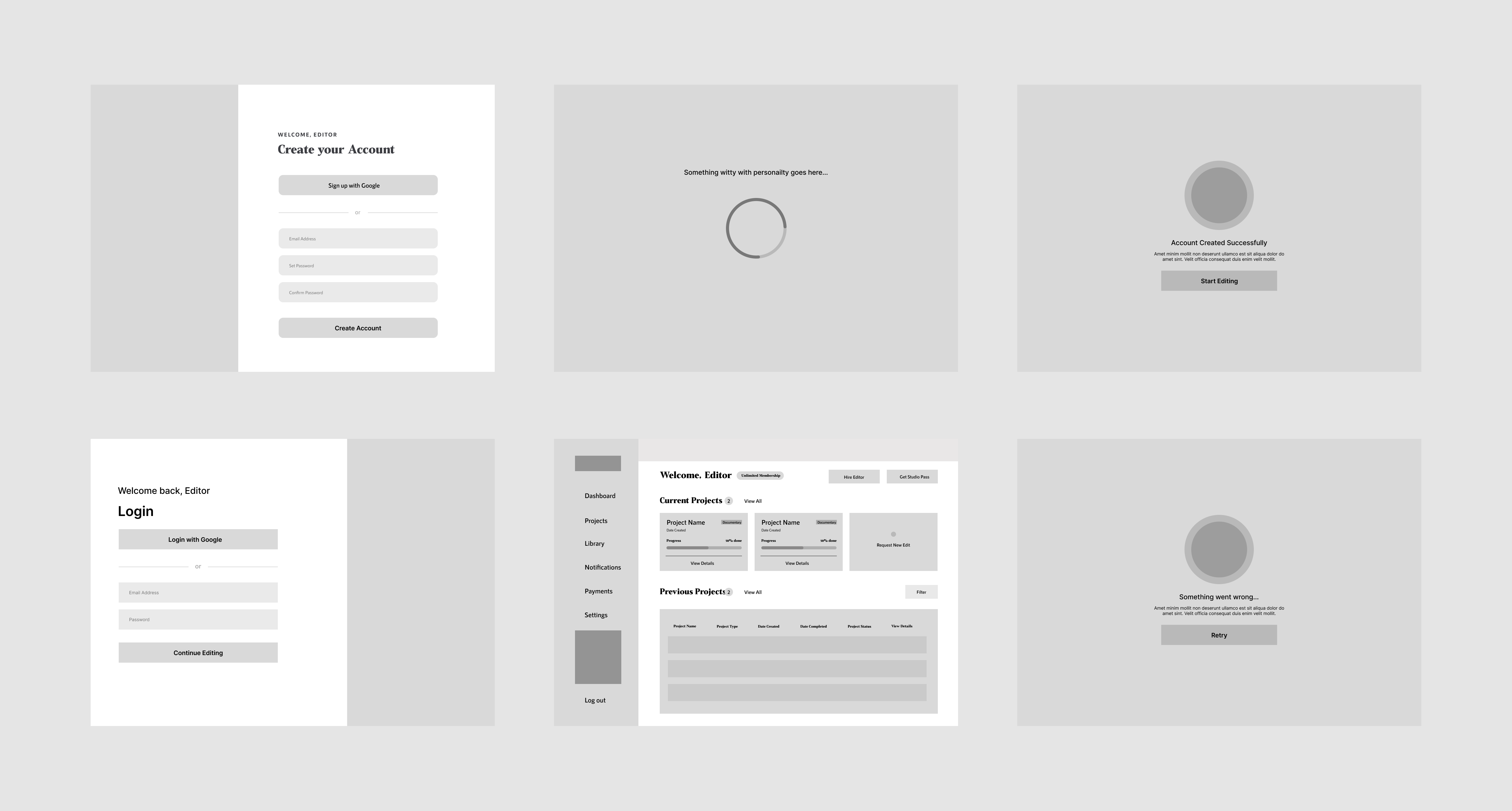
I made sure the brand personality came through in the designs through the use of colorful assets, imaginative layouts and bouncy interactions. I opted for a much simpler layout for the forms to prevent visual overload and help the user focus on filling the forms.
These were optimized to ensure an equally smooth and enjoyable experience on smaller screens.
.gif)
.gif)
.gif)
.gif)
.gif)

Working as the only designer on this project was really eye-opening. From holding meeting with clients to various presentations, I learned a lot about active listening and rationally explaining the logic behind my design choices in really simple terms.
Another thing I learned was how to design dispassionately and make necessary trade-offs when necessary. An example is - during the process, I had to make a complete 180 because I realized the initially agreed upon flow would take more time (which we did not have) without making much of an impact. I explained this to the stakeholders and drew up another much simpler flow that would be easier to implement while still fulfilling the brief.
Next steps would be to monitor user experience with the product and reiterate where necessary.