
I led the brand identity revamp for TESA - a company focused on empowering video editors in Africa.

The Edit Space is a supportive space for upcoming film and video editors. It nurtures their skills and guides them on industry best practices in a community framework. While the brand was established to tackle a definitive need and has the potential for success, it has found difficulty connecting its services with its target users.
The first step was to diagnose the problem. This entailed carrying out client and user facing surveys and other forms of research in order to try to pinpoint the root cause of the dichotomy between the brand and its users. Some of the questions asked during the survey include:
● What problem does your brand solve?
● Can you give a brief overview of your business?
● What is the meaning or story behind your name?
● Describe your brand in only one sentence
● If you had to choose three words to describe your brand, what would they be?
● Who is your dream client or target audience? (Gender, age, location, income, values, occupation)
● How will these people be drawn to your business?
After collating the responses, the first thing that stood out was the fact that the existent brand assets, from tone of voice to graphic assets used, were going in the totally opposite direction to where the brand wished to be. It felt outdated, the target demographic found them hard to relate with, overly stylized, and the logo in particular was not scalable across most digital platforms.

Following analysis of their target audience, it was determined that the brand persona was in line with The Everyman whose primary motivations are to have a sense of belonging and enjoyment. The words describing it being - YOUTHFUL, FUN, FRIENDLY & RELATABLE
First, I identified the key elements or tags that relate to the brand as a whole and streamlined this list to what works well for the brand. Then, I settled on strategically infusing the elements to reflect feelings of belonging in a unique, distinctly definitive way.

During this process, one big challenge was finding the best way to structure the logo.

I decided to go with the chosen layout because it was the most visually balanced and accessible layout. Another reason was the arranged elements made up a long lens camera, which made it easy to associate the logo with videography and film.


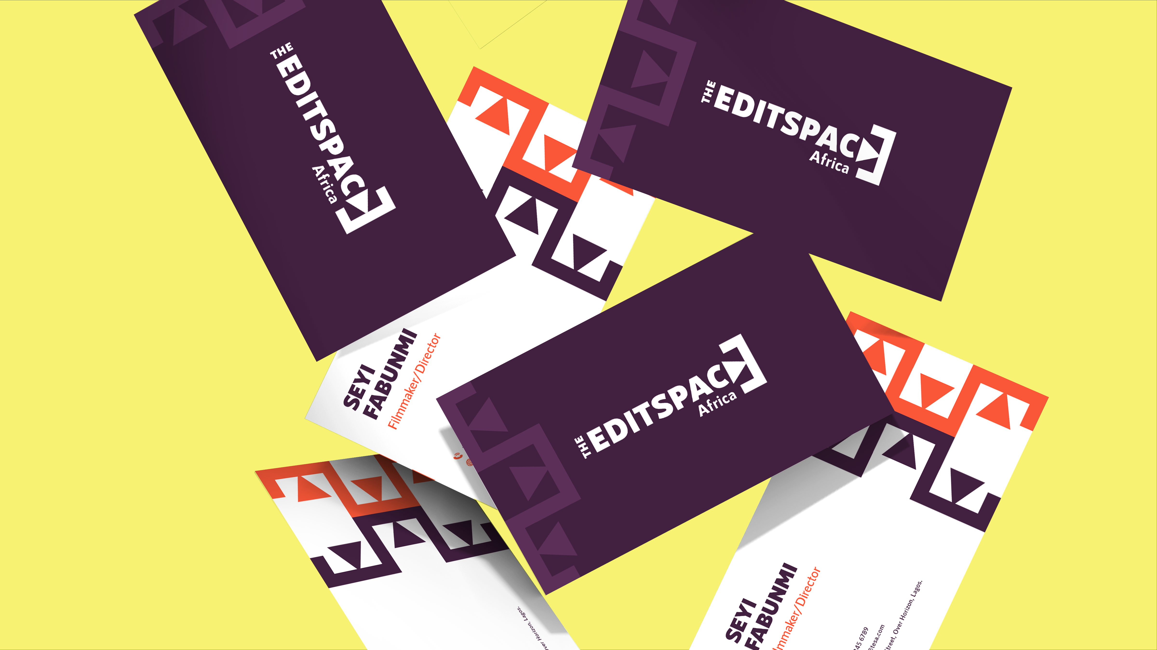
Dark Purple and Orange Soda were chosen as the primary colors for The Edit Space Africa.
Dark Purple represents creativity, intelligence, and empathy. The target audience will feel a sense of inspiration and belonging when interacting with the brand.
Orange Soda represents fun and fosters communication. It evokes feelings of excitement, high energy, but also warmth. It promotes positivism and optimism.

A combination of sans serif and serif fonts that properly represent the brand personality.
RNS Sanz is easy to read, simple, and straightforward.
Native Txt brings the fun, vibrancy and brings a bit of flair to the mix.

The pattern was created by replicating the logos to simulate a connected workplace.


Now this phase has been completed, the next steps are to design a befitting website that would help establish a platform for prospective editors to utilize and engage with the company's services, further imprinting the brand visibility in the minds of their target audience.