I designed a website that applied the visual language of green energy to the brand and messaging for an environmental and sustainability consulting firm that seeks to foster the co-existence of business & nature.

Blanc Enviroconsult blog page (SMEGreen) is a feature that’s frequently visited and shared by users. This page is the most important on the website, as it is the first page that can be populated with interesting content to drive conversions to the main website. This page, however, was not inviting enough as it lacked personality & structure. As a part of product discovery, I also conducted a heuristic evaluation & SEO Testing of the entire website which revealed various UX violations that were hurting the website, some of the egregious violations being:
● Sluggish screen loading time
● Poorly structured and unfinished content


Once the problem mapping was done, the UX team - I and Uzoma (UX Writer) sat down with the client to present our findings. While our recommendation was to perform a complete redesign of the website, structuring SMEGreen as a means to funnel users to the service offerings of the company and increase conversions. However, due to some constraints, the client was unable to provide most of the services showcased on the website at the time of the meeting.
Following a brainstorming session, we were able to construct an information architecture that creates some sort of dichotomy between the main website and SMEGreen. We would make SMEGreen exist as a separate ecosystem housing blogposts and resources. It would be the main website for now, It would also have links directing users to learn more about the company. The point of this was to keep putting out content and resources to maintain top of mind awareness with users pending when the company is able to restart the services.


Once we had gotten the card-sorting process done, I proceeded to design wireframes, reiterating severally till the final prototypes were ready.
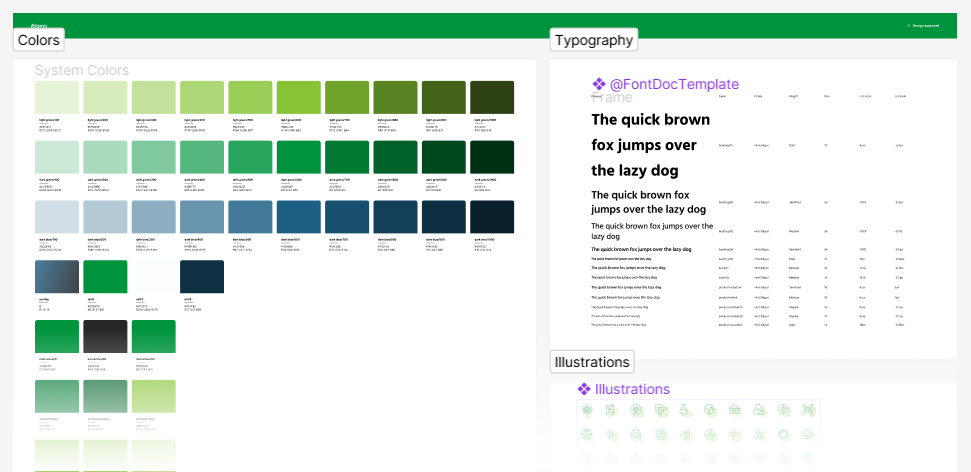
To maintain consistency and ensure efficient design to dev handover, I developed a modular design system based on reusable components and their states, such as cards, list items, and controls. Every component can be rearranged and combined with others while maintaining design consistency and recognizable UI patterns for the user.


The new design has been well received by our client and is currently undergoing development.